Usability guidelines and design heuristics, such as Lockwood's "Principal Principles" from page 4 of "What Do User's Want?", are helpful aids in designing user-friendly systems. But they are rarely steadfast. In certain situations, a system is actually more usable if it breaks a guideline. Even in normal cases, guidelines frequently contradict each other. Here are a four example cases.
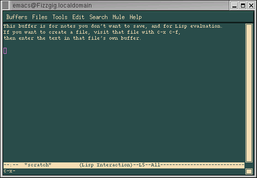
Emacs unsuccessfully violates Constantine's First Rule: Access, which states that users skills in the domain area shouldn't need instructions to use a system designed as a tool for that domain. Following this, anyone who can write a letter (or at least type one on a typewriter) should be able to sit down at a word processor and compose a letter.
I've used a number of different word processors, but the learning curve is rarely as steep as that of Emacs. This is probably due to Emac's lack of Visibility (another of Lockwood's principles) of available features. Users must remember key-combinations to perform actions, such as "Control-X, Control-C" to exit. This difficulty is not just because it is text-based. Pico, another Unix text editor, is easy to use because of the visibility of most of its options at the bottom of the screen. The X-windows version of Emacs shown here is better than Emac's traditional form because it has menus of some of the possible options, but it still has a ways to go.
Yet, perhaps because it does force users to learn its various esoteric key binding, Emacs does succeed on Lockwood's Second Rule: Efficiancy, which states that skilled users shouldn't be impeded in their work by the system. A skilled Emacs user can certainly be a letter-writing powerhouse! Learning is helped somewhat by complying with the Reuse principle: most Emacs file-based actions start with Control-X, Control-g always exits from the middle of a command, etc. The quick buffer line, shown at the bottom of the screen where the "C-X -" is displayed, also helps by successfully and conveniently providing Feedback while entering long commands.
Opera's status bar is another example of successfully upholding the principle of Feedback. I frequently rely on web browser status bars. (I HATE JavaScripts that override my status bar!) What is interesting about Opera is that the amount of information it provides: the current resource, the percentage of the HTML document downloaded, the number of images to download, etc. Yet, once the page is loaded, the top half of the status bar, which is no longer relevant, disappears. This frees up another 1/2 inch of screen real estate.
UH's online course registration system PA'E uses phone-related controls. At first, this seems to unsuccessfully violate Lockwood's Fifth rule: Context, which states that a system should be suited to its operational context. PA'E is web-based, so it seems that normal text links and form controls could have been displayed in a single window. Instead, a number of "phone buttons" are crammed into a frame on the left.
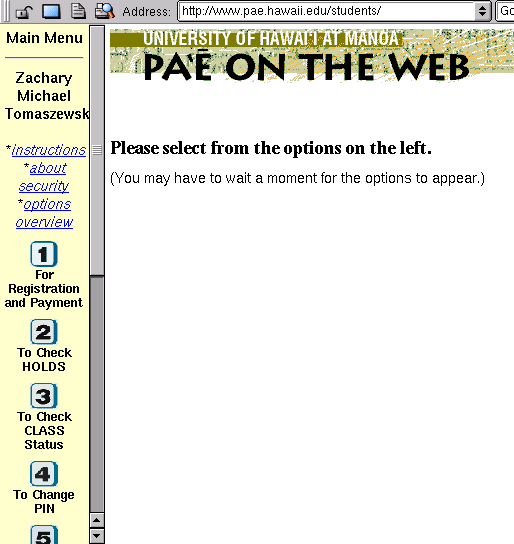
But, in the broader context of registering for classes at UH, this may have been a wise design choice. PA'E is traditionally accessed through a touch-tone phone. By designing the web-interface this way, both forms of the system use the same controls. Printed instructions can say "press 1, then press 4 to view your schedule," and this will apply to both forms. In this case, PAE violates web-based Context in favor of successfully upholding over-all system Consistency in a phone-based Context. (Additionally, the phone buttons do follow Mitre's guideline 2.2/8 calling for distinctive labels to help differentiate controls from data.)
Finally, though I don't have a "screen shot," a system that unsuccessfully upholds the principle of Consistency is the internal architecture of UH's POST building. Arranged around a central cube, the four hallways of each floor are extremely similar to each other. I am constantly getting disoriented, especially with respect to the outside world, because there are no major differences between the hallways. Luckily, small differences, like room numbers, bulletin boards, and restrooms, give some slight orientation guides. Perhaps Consistency was a little too emphasized in this design.
As one can see, guidelines are frequently a matter of interpretation. Their application depends on many factors and tradeoffs. Even the principles themselves can contradict each other, and the developer must choose adherence to one over another. Yet the designer's choice may not be the same choice the users would have made. Clearly, empirical evidence from the users themselves would be of help in system design.
| ~ztomasze Index:
CIS: Assignment 1 http://www2.hawaii.edu/~ztomasze |
Last Edited: 10 Sep 2002 ©2002 by Z. Tomaszewski. |